EdTech · Website
Your-Tutor Website
The marketing website for the Your-Tutor platform.
About the project
What was designed.
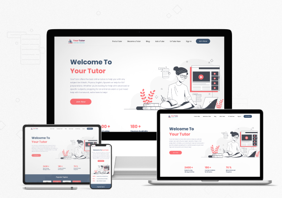
The website has one job, turning a parent or student looking for help into an account, so the home page states the offer in three lines and repeats Join Now in the header, in the hero and again after the proof. The hero pairs that promise with an illustration of the product in use instead of a stock photograph, which keeps the page light and on brand at every width.
Underneath, a row of figures and a popular-topics band answer the next two questions: is anyone else using this, and do you teach my subject. The navigation splits the two audiences at the top, find a tutor and become a tutor, so neither has to wade through the other. We designed the layout at four widths, and the coral and navy palette, the type scale and the button set were defined once as a system the rest of the site reuses.
Get a free 15-point UX audit of your product.
Send us the link. Within one working day you get what to fix first, and why.