EdTech · Dashboard
Your-Tutor Dashboard Design
The web app of a tutoring platform, built around the hardest step: finding the right tutor.
About the project
What was designed.
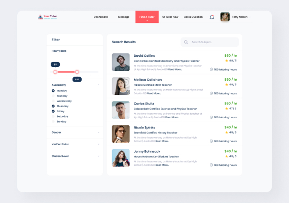
Choosing a tutor is a comparison task, so the screen is a filter panel beside a result list and nothing else. Hourly rate is a two-handle range slider, availability is a day-by-day checklist, and gender, verified status and student level collapse into the same column to keep the panel short. Filters change the list in place; there is no separate results page to travel to.
Each result carries only what a parent or student actually compares: photo, name, the subject and certification line, two lines of biography with a read-more, the hourly rate, the star rating and the hours taught. Rate and rating sit in a fixed right-hand column so they line up down the page and can be read without reading a single row. The signed-in navigation keeps messages, questions and booking one click from the search.
Get a free 15-point UX audit of your product.
Send us the link. Within one working day you get what to fix first, and why.