SaaS · Dashboard
Audit Management Dashboard
A web dashboard for managing clients, audits and users in a compliance workflow.
About the project
What was designed.
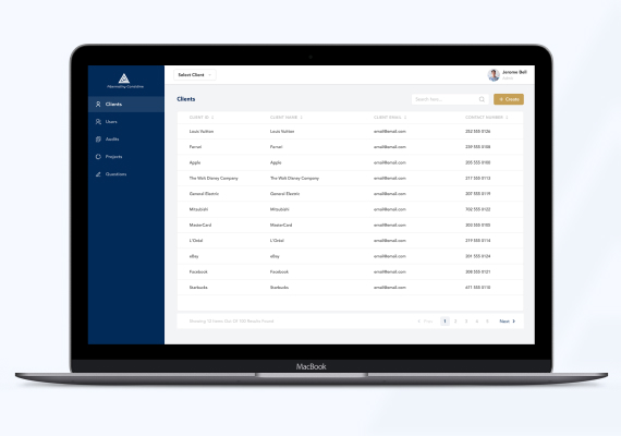
This is a working tool for people who process audits all day, so the interface gets out of the way. A dark navy rail holds five destinations (clients, users, audits, projects, questions) and everything else is one white content area. The client switcher sits in the top bar rather than in the sidebar, because almost every task in the product starts by choosing whose records you are working in.
The list screens are a single pattern repeated: title, search field, one create button in the accent colour, then a table with sortable headers, generous row height, and a result count with pagination underneath. There is exactly one bright element per screen and it is the action you came to perform. Colour is used for state, never for decoration, which keeps hundreds of rows legible and lets clients, users and audits share the same layout without any of them being redrawn.
Get a free 15-point UX audit of your product.
Send us the link. Within one working day you get what to fix first, and why.