Retail · E-commerce site
Speedy Mart Website
A grocery and bakery e-commerce site: department browsing, product listings and a shop that still reads as local.
About the project
What was designed.
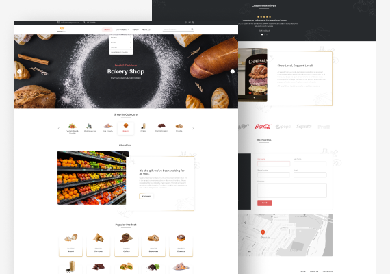
A grocery site lives or dies on how quickly someone reaches the aisle they came for, so the header carries the product menu and a search field at all times, and the first thing under the hero is a category carousel with an icon per department. The hero itself is one photograph and three lines of type, rotating by department, which lets the shop lead with bakery this week and produce the next without a redesign.
Below that, the page alternates a photograph with a gold-ruled text panel, about the shop and then shop local, so a long page keeps a rhythm instead of becoming a stack of blocks. Products sit in a plain card grid with image, department and name and nothing competing. Reviews move onto a dark band to separate them from the selling, and the page ends where a neighbourhood shop should end: a contact form and a map.

Get a free 15-point UX audit of your product.
Send us the link. Within one working day you get what to fix first, and why.