SaaS · Web app
The Disk Manager Webapp
A multi-module records platform, and the in-app tutorial library that teaches people how to use it.
About the project
What was designed.
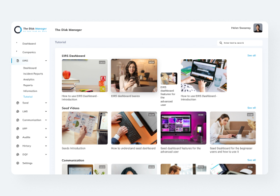
The application carries a lot of product in one place: incident reports, analytics, reporting, learning, communication, audits and history each have their own module. The first design problem was therefore navigation, not screens. The sidebar collapses every module to a single line and expands only the one in use, so a page buried three levels down still shows where it sits in the whole.
The screen here is the tutorial library, which exists because a platform this wide has to teach itself. It is laid out like a video service rather than a help centre: rows grouped by module, each with a see-all link, cards carrying a thumbnail, a duration badge and a plain-language title, and one search field across the lot. Someone stuck on the incident reports dashboard finds the answer in the row named after it, without leaving the product to look for documentation.
Get a free 15-point UX audit of your product.
Send us the link. Within one working day you get what to fix first, and why.